
 I must confess that, prior to making this scarf, I was pretty ambivalent to Piet Mondrian and De Stijl (the group in which Mondrian was one of the founding members) in general. At a first glance, Mondrian’s signature style– using the primary three colors (red, yellow, and blue) and primary values (white, black, and gray) in patterns of squares, rectangles, and straight lines– appears almost too simplistic. However, as I worked my way through the scarf, I grew to appreciate the purity of the colors and values, the geometry of the shapes, and the vertical and horizontal lines. But before I get to ahead of myself, the questions that must first be asked are: Who was Piet Mondrian, and what is De Stijl?
It took a long time to discover that particularities of form and natural color evoke subjective states of feeling, which obscure pure reality. The appearance of natural forms changes but the reality remains constant. To create pure reality plastically, it is necessary to reduce natural forms to the constant elements of form and natural color to primary color. The aim is not to create other particular forms and colors with all their limitations, but to work toward abolishing them in the interest of a larger unity. The problem was clarified for me, when I realized two things: (a) in plastic art, reality can be expressed only through the equilibrium of dynamic movement of form and color; (b) pure means afford the most effective way of attaining this. (Piet Mondrian, “Toward the True Vision of Reality,” 1941)

Piet Mondrian, Evening; The Red Tree (Avond; De rode boom), 1908-10, oil on canvas, Geementemuseum de Haag, Source
Piet Mondrian (nee Pieter Cornelis Mondriaan, 1872-1944) was a painter from Amersfoort, Netherlands. Educated at the Rijksakademie van Beeldende Kunsten in Amsterdam, his early works are comprised largely of representational, Dutch-Impressionistic landscapes or other pastoral imagery. He also dabbled a bit with Fauvist, Pointillist, and even Symbolist styles in his search for his own unique aesthetic. In 1911, he was first exposed to Cubism during the Moderne Kunstring exhibition in Amsterdam. He moved to Paris shortly after, changed his last name from Mondriaan to Mondrian, and began painting works that demonstrated a distinct influence from Cubists Pablo Picasso and Georges Braque. These paintings show an increasing departure from representationalism and more interest in interlocking planes and geometric shapes.

Piet Mondrian, The Gray Tree, 1912, Source
Mondrian, who was raised in a strict Protestant household, was a deeply spiritual man and sought to find a way to fuse his theosophical interests with his art. In 1913, he began to break away from representational art completely and started working towards a theory that combined his artistic and religious interests. In 1916, Mondrian was living at an artist’s colony in the Netherlands with fellow Dutch artists Bart van der Leck and Theo van Doesburg, waiting for the end of World War I. Van der Leck and van Doesburg were also on similar pursuits towards abstraction, and van der Leck’s sole use of primary colors greatly influenced Mondrian’s future work. In his only autobiographical essay, “Toward the True Vision of Reality” (1941), he states, “I forsook natural color for pure color. I had come to feel that the colors of nature cannot be reproduced on canvas. Instinctively, I felt that painting had to find a new way to express the beauty of nature.”
In the color theory of art, completely unadulterated primary colors– red, yellow, and blue– are “pure” colors in they are not the result of a mix of other colors, they just simply are what they are. Black is a combination of all primary colors, while white is the total lack of color (interestingly, the primary colors in white light are red, green [which, in art, is a combination of yellow and blue], and blue; also, white light is comprised of all colors while black is the total absence of color. But I digress: that is a discussion for a different blog). Some regard black, white, and all of the shades in between to be non-colors. Considering Mondrian’s desire to infuse spiritualism into modern art, the purity of the primary colors, as well as the simplicity of black, gray, and white makes sense.

De Stijl (Dutch for “the style”) officially formed in 1917 with van Doesburg helming the De Stijl journal, which sought to promote the group’s theories. The other principal members were Mondrian, van der Leck, artists Vilmos Huszar and Georges Vantongerloo, and architects J.J.P. Oud, Gerrit Rietveld, and Robert van ‘t Hoff. According to the Guggenheim Museum,
The essential idea underlying De Stijl’s radical utopian program was the creation of a universal aesthetic language based in part on a rejection of the decorative excesses of Art Nouveau in favor of a simple, logical style that emphasized construction and function, one that would be appropriate for every aspect of modern life. It was posited on the fundamental principle of the geometry of the straight line, the square, and the rectangle, combined with a strong asymmetricality; the predominant use of pure primary colors with black and white; and the relationship between positive and negative elements in an arrangement of non-objective forms and lines.

Piet Mondrian, Composition with Large Red Plane, Yellow, Black, Gray, and Blue, 1921, Source
Mondrian wrote a series of essays outlining his personal art theories starting in 1917, and he referred to the central idea behind his theories as Neoplasticism, or “the new plastic art.” “Plastic” in this context refers to a novel way to represent a universally harmonious reality– or rather, in the words of Hans Locher in Piet Mondrian: Colour, Structure and Symbolism, ” the ‘true reality’ [that] would become emancipated in the future in part of a general process of spiritualization”– in painting and sculpture. The term Neoplasticism is often used interchangeably with De Stijl, but it largely applies to Mondrian’s personal style and influence on the group during his tenure with them: he believed that pieces needed to be limited to strictly primaries, square and rectangular shapes, and straight vertical and horizontal lines. This was solidified his signature style in 1921. The reason he eventually left the group, which occurred around 1924, was because of a disagreement with van Doesburg over the latter’s desire to start using diagonal lines (oh, the problems of artists…). Only one of Mondrian’s paintings completed after he adopted his personal principle of Neoplasticism ever exhibited diagonal lines: Lozenge shape with grey lines, which was completed in 1918.
After the end of World War I, Mondrian moved back to Paris and further explored his theory of Neoplasticism in his art. In 1938, he went to London in an attempt to flee the rising tide of fascism and the Nazi party. It was there that he caught the attention of the great modern art collector Peggy Guggenheim, who passionately promoted his work and later displayed it in her iconic “Art of This Century” Gallery. He moved to New York in 1940 when the British became entrenched in World War II and joined the American Abstract Artists. While he continued to use primary colors and vertical/horizontal lines in his work, he eventually moved away from singular black lines and into double lines, then color lines, and eventually lines with multiple squares of primary colors. A greater number of his later canvases were tilted at a 45 degree angle to create his “lozenge” paintings, but his lines always stayed perfectly vertical or horizontal. He died of pneumonia at the age of 71 in 1944.

So why was I originally ambivalent to Mondrian and De Stijl? I suppose the answer is that, in many ways, I am a bit of a traditionalist when it comes to art. Oftentimes I prefer complexity and technical skill over concept. And by “oftentimes” I mean “most of the time.” Having made a fair amount of art in my lifetime, I admire pieces that make me think to myself, “Good lord that must have been a challenge,” and let’s be honest here: many of Mondrian’s paintings are just a bunch of red/yellow/blue/white/black/grey squares and rectangles separated by black lines. Visually, there’s not a lot to them… But that, of course, is precisely the point. As I crocheted the Mondrian-inspired scarf, I thought a lot about how hard seemingly simple paintings can be, not just in terms of concept but also in execution. I mean, look at those black lines in Composition with Large Red Plane, Yellow, Black, Gray, and Blue: they are SO STRAIGHT and consistently precise in width. Also, if an artist is mixing his or her own colors, it can really difficult to keep the pigment uniform in its binder, and Mondrian was painting pretty sizable flat planes of color (although his brush strokes do create a very subtle depth to those planes).
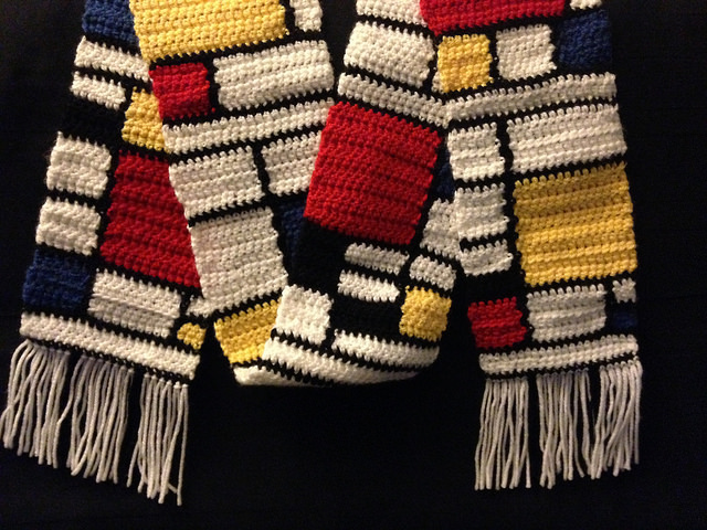
The Mondrian-inspired scarf is made out of Vanna’s Choice Yarn, which is a nice, thicker yarn that produces a very warm fabric. I chose this yarn because it had the brightest and most primary-looking blue and red (though the yellow is just a tad bit too light). I chose not to use any gray because I like the clean simplicity of black and white juxtaposed with the primaries. It felt like this scarf worked up really quickly, though I think what really helped was the constant color switches. Furthermore, as I worked my way across the rows and color changes, I found myself contemplating each color, admiring its purity in its separation from the other colors. Crochet is already a somewhat meditative process for me, and creating a continuous Mondrian-esque composition took my mind to a whole new level. Indeed, I may have had some sort of spiritual experience– perhaps like the spiritualism Piet Mondrian strove to imbue in his art and process. Whatever the case may be, I think this is going to be the first of other Mondrian-inspired works in my crocheting future.
Additional sources
Locher, Hans. Piet Mondrian: Colour, Structure and Symbolism. Berlin: Gachnang & Sprinter, 1994.
The New Art – The New Life: The Collected Writings of Piet Mondrian. Trans. Harry Holtzman and Martin S. James. Boston: G.K. Hall & Co., 1986.

Did you make up the pattern for this? It’s amazing – I would love to do it but I don’t have those free styling skills!!
LikeLike